Bay Street House
- Location Santa Monica, CA
- Type Houses
- Area 4800SF
- Completion 2019
- Client Private
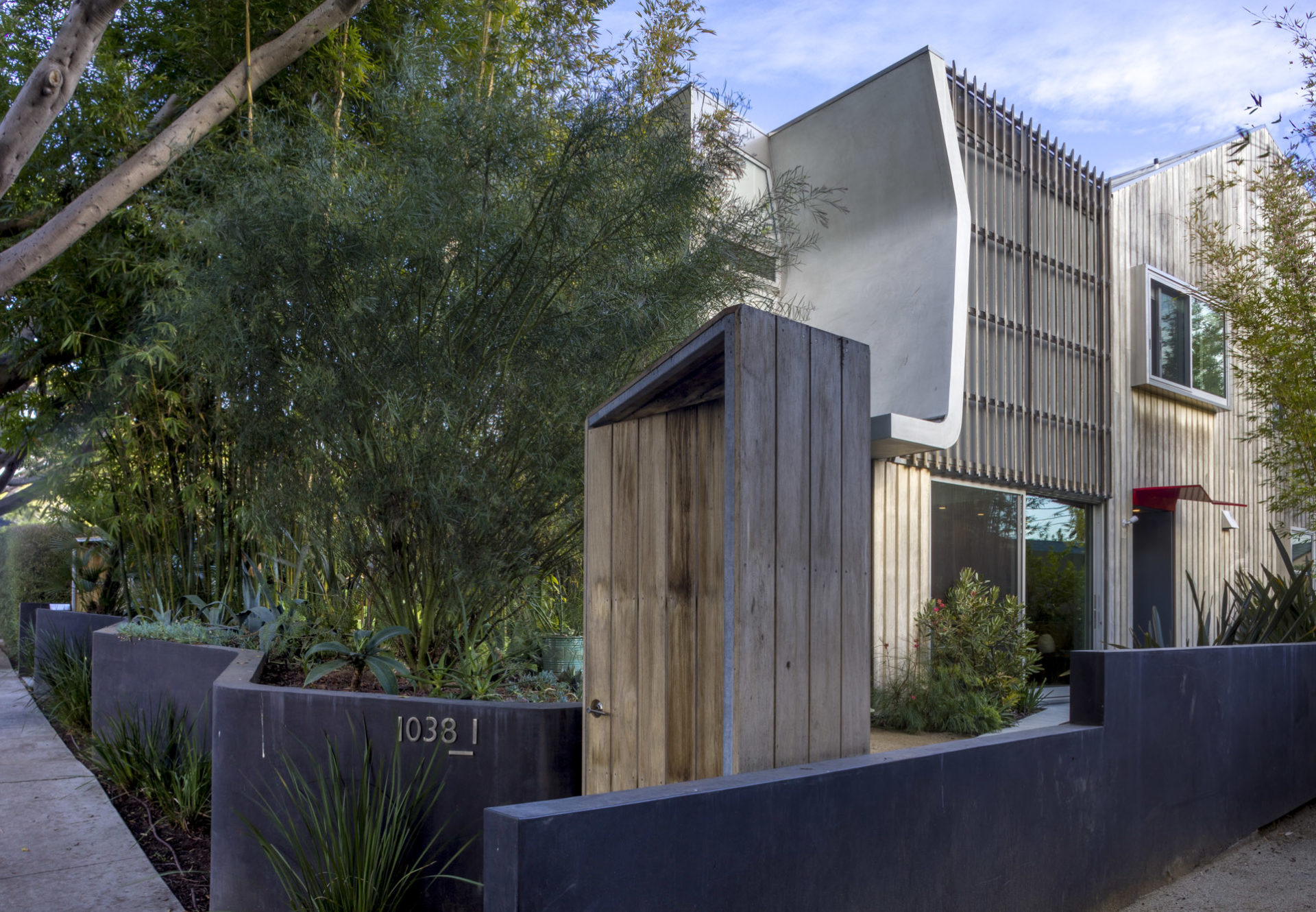
Los Angeles’ housing problem is shaped by a lack of density, and a land use pattern that prioritizes backyards and auto parking at the cost of efficient use of limited domestic real estate. The challenge of increasing the density of established neighborhoods without fundamentally changing their character is at the core of the Bay Street project. The site was developed to respect existing urban characteristics: each unit has a front door accessible from the street, while parking is accommodated from the alley. While the site could have been developed to a three-unit capacity, two units were developed in order to speed construction and minimize the environmental impact of an extensive underground parking garage.
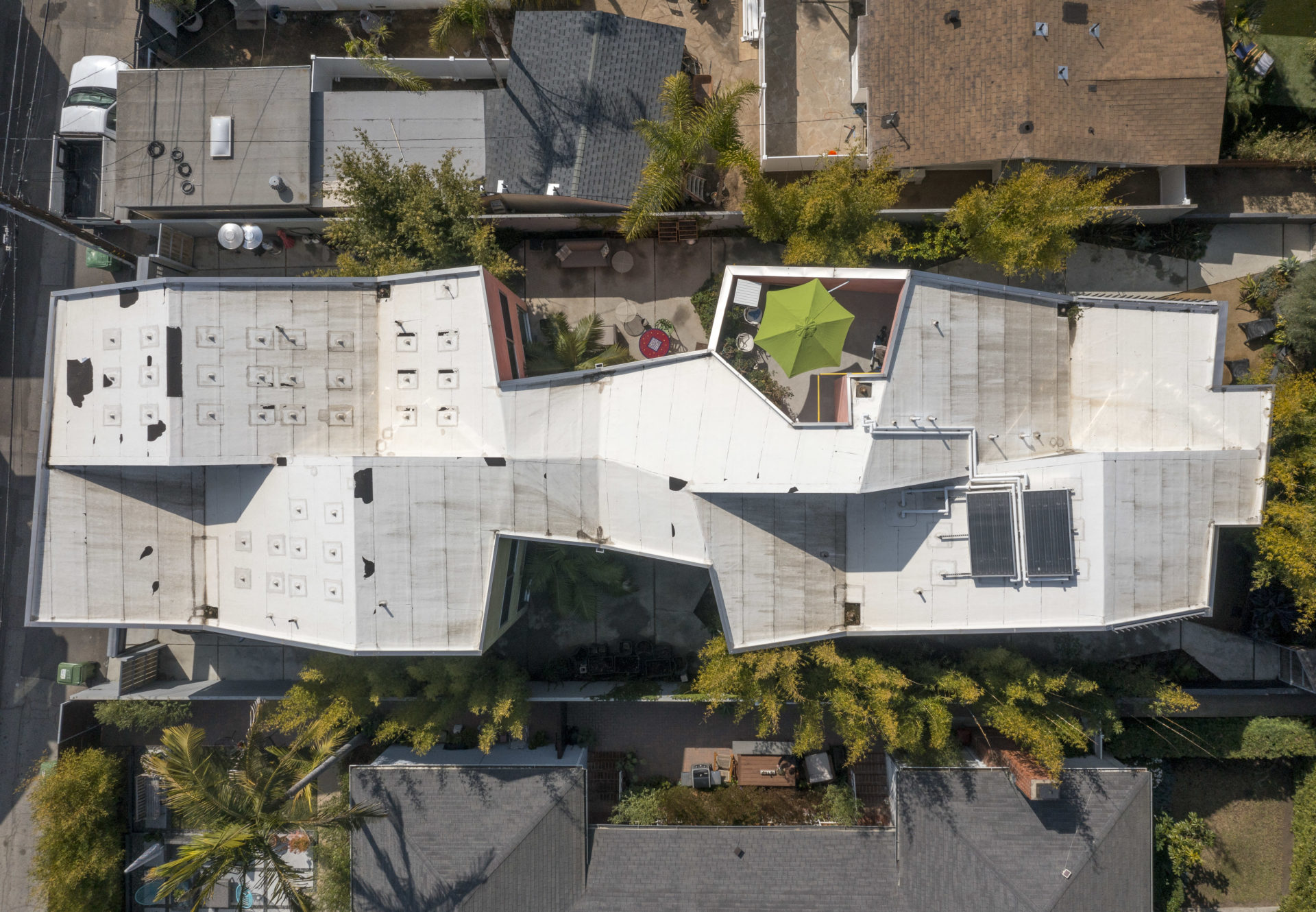
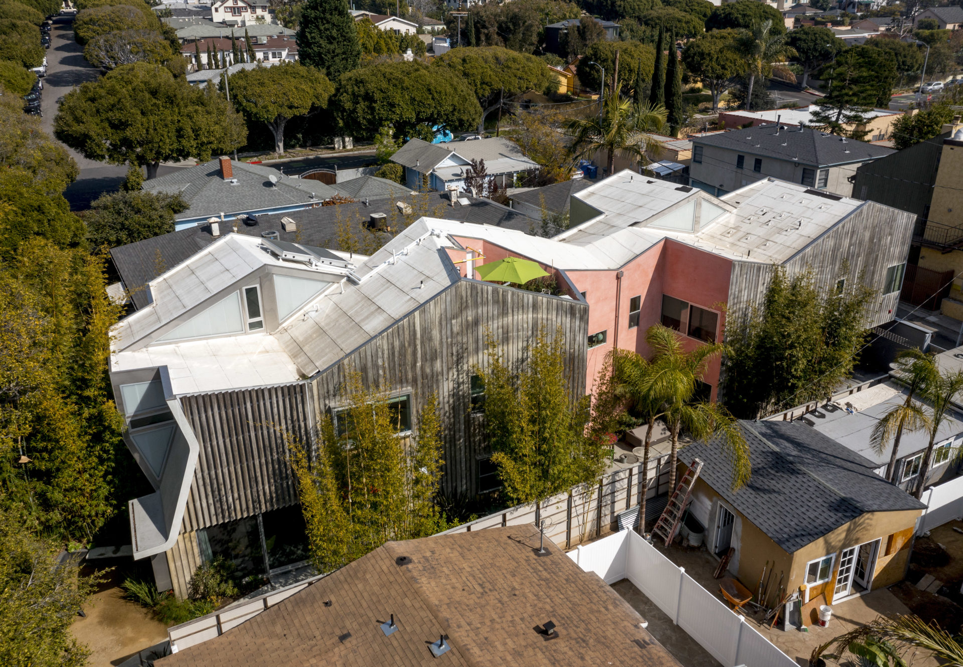
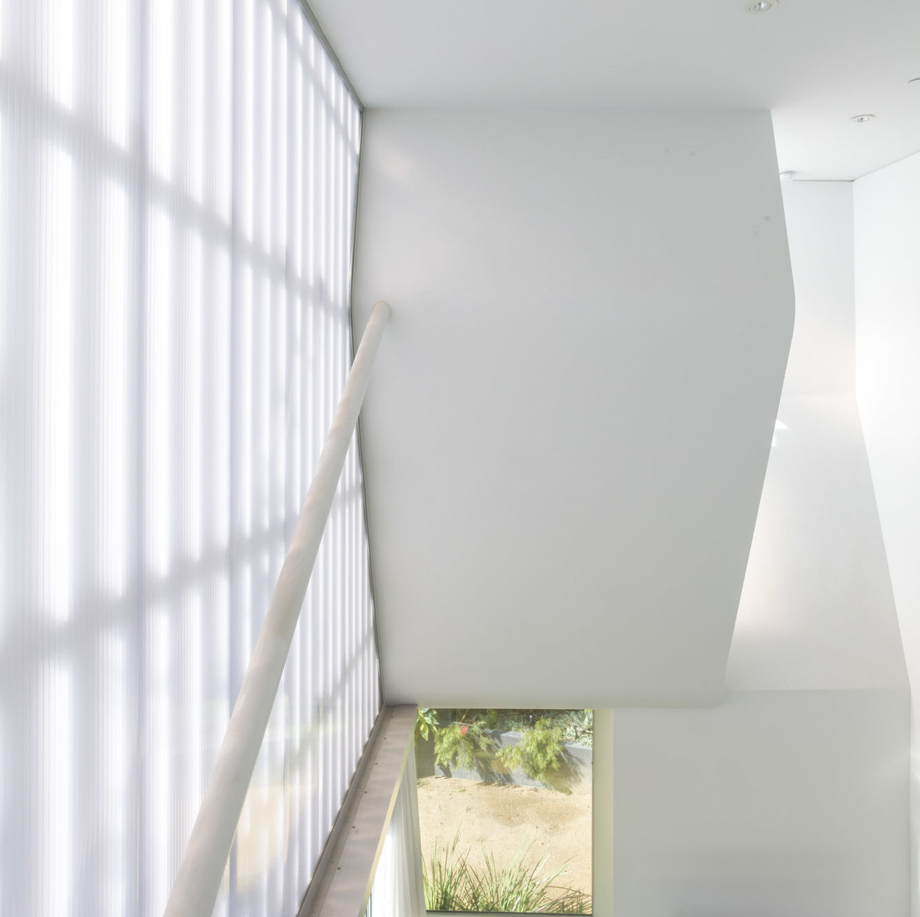
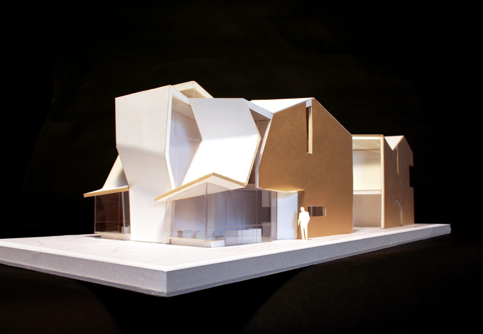
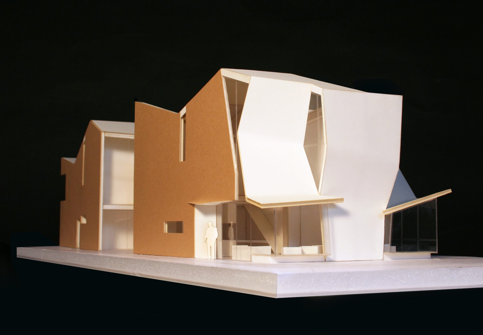
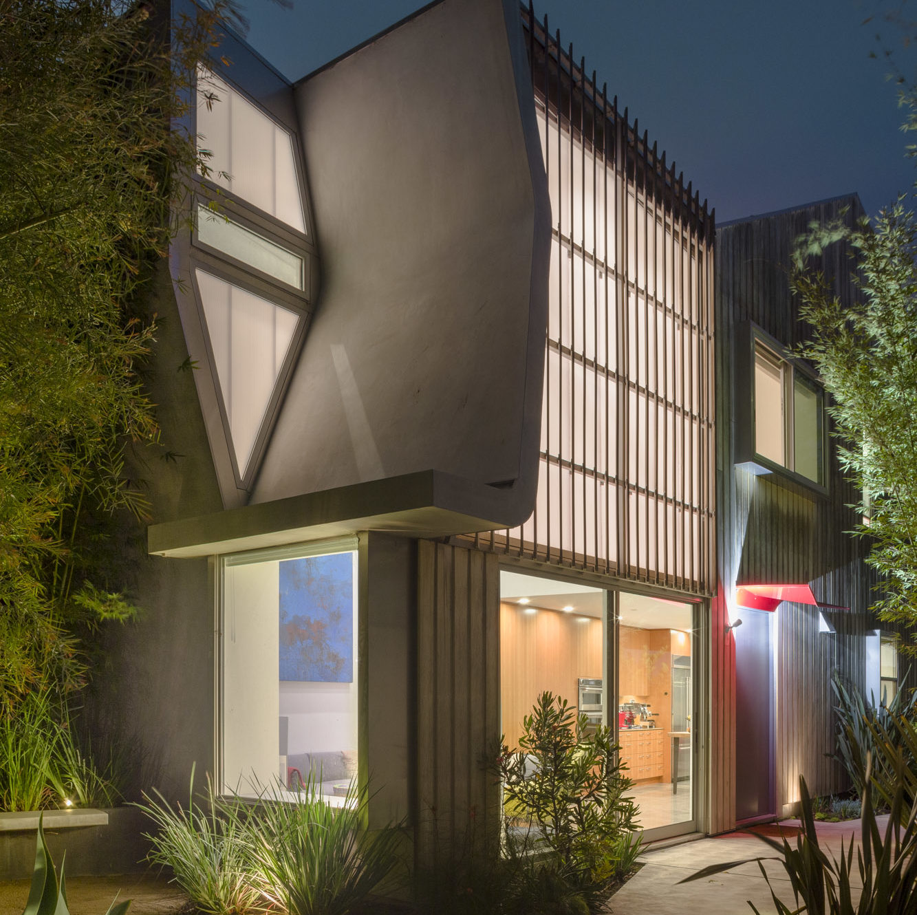
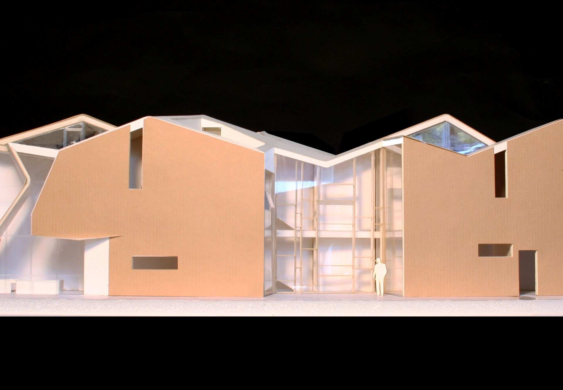
Responding to arcane and arbitrary zoning regulations, the two-unit residential project takes the form of a long prismatic object, faceted and shaped to meet requirements for setback and upper story stepbacks. The left-handed and right-handed units create a single geometric object, joined at the center by a common masonry bearing wall that carries the primary structural loads of the building. The wall meanders along the length of the site, pushed and offset to allow for nested stairs serving each side of the building.
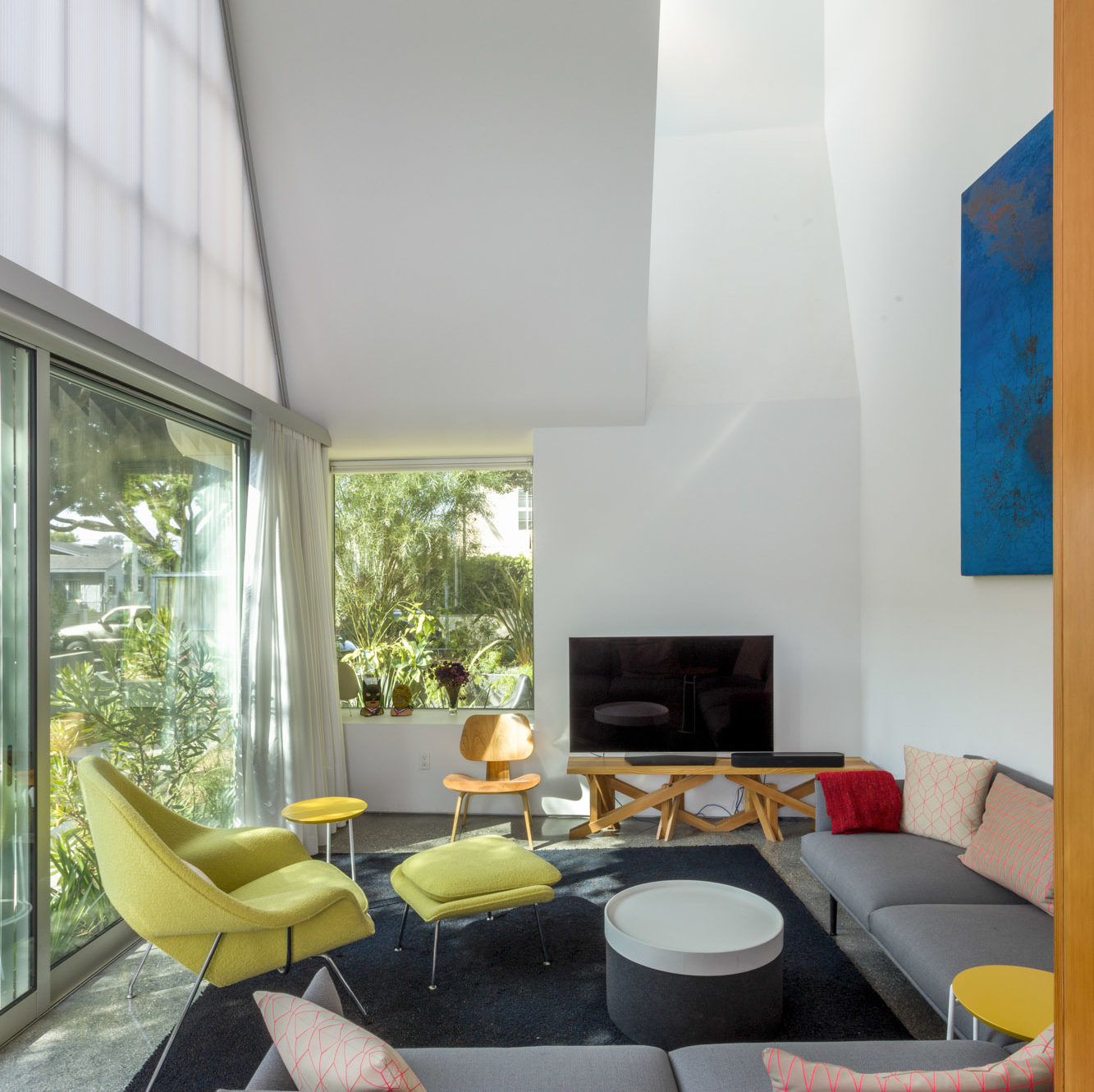
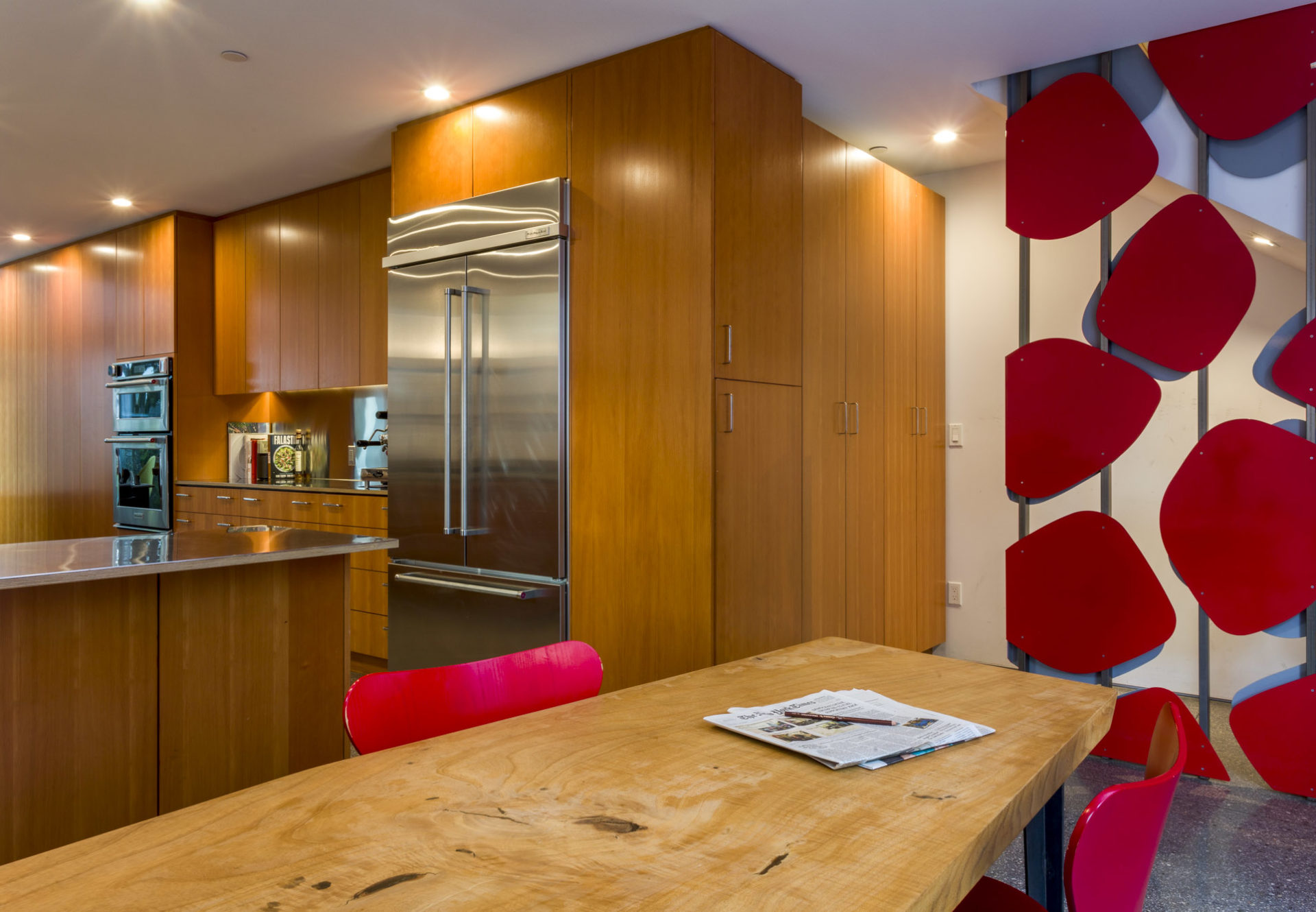
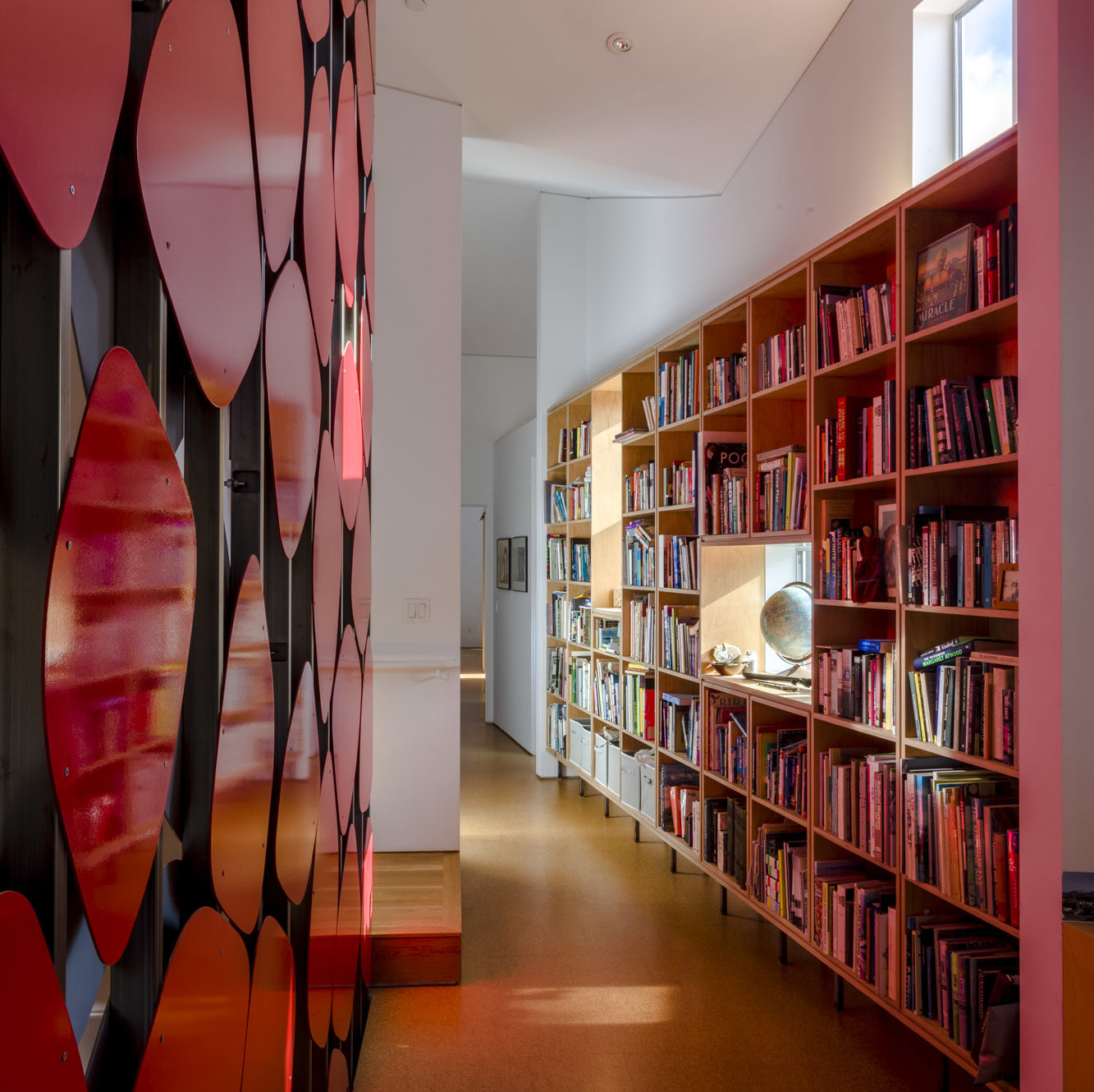
The units are seemingly identical—with living, kitchen, and dining downstairs and a loft mezzanine, private interior courtyard, and rooftop garden above—yet one unit is not the mirror image of the other. Known in the natural sciences as chirality, a form of nearly identical difference makes each unit unique yet the same, conveying a reciprocal relationship between elements as they move away from the central wall in opposite configurations. This linearity allows both units to have street frontage, a unique amenity that is not possible on typical lots where town houses are built.
The linear organization and common wall create a challenge as well: each unit has a single long elevation for access natural light and ventilation. To maintain balanced day light throughout the day and year and in order to afford cross ventilation, primary windows are located in the short courtyard facing exterior walls while the roof line is folded into a continuous, offset series of gables. Reminiscent of Diebenkorn’s paintings of Ocean Park roofscapes, the form of the building is a performative scatter of roof planes allowing light and ventilation into the adjacent unit throughout the day.
